Vocabulary and samples: speaking to your florist about colour matching
 Save
When you need flowers to match a specific colour scheme, describing what you want in words alone rarely gets you there. Florists work with living material whose tones shift with the light, the season and the variety, so the clearer you can be about the exact shade you need, the better your arrangement will turn out. This guide from Harvest Moon Floral Art shows you what to bring to the conversation, the terms that help a florist understand your palette, and how to set expectations when a perfect match isn't possible.
Physical samples that remove guesswork
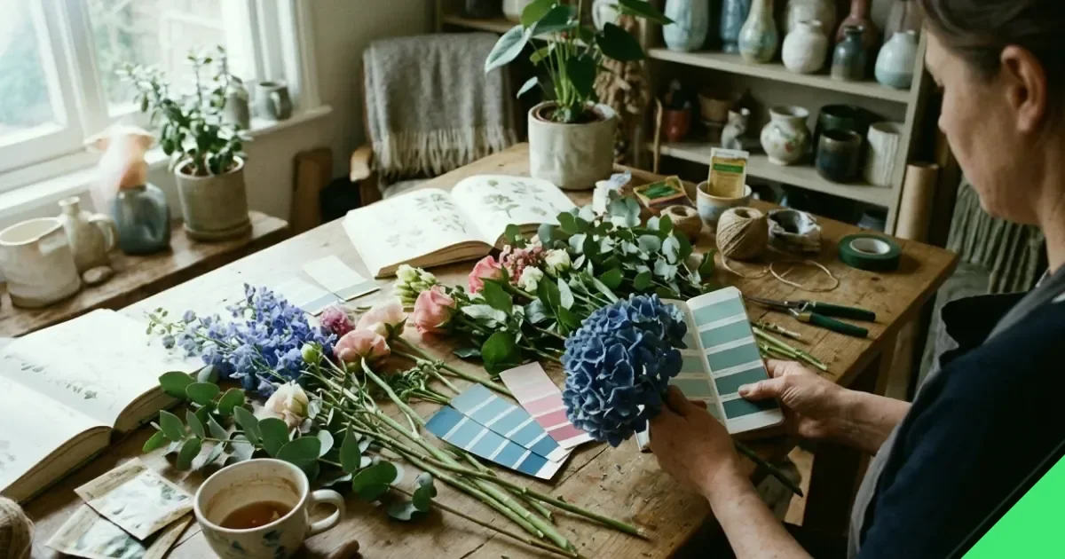
A fabric swatch, a paint chip or a photograph of the room brings you closer to an accurate match than any verbal description can. Florists see colours under different lighting throughout the day, and what you call coral might read as peach or salmon to someone else. A physical reference lets both of you look at the same thing and agree on the target.
Fabric works especially well for weddings and events where you're matching bridesmaids' dresses or table linen. Cut a small square and bring it to the consultation. Paint chips from a DIY shop are useful when you're coordinating flowers with interior decor. If you're working from a photograph, make sure it was taken in natural daylight rather than under artificial light, which can shift tones considerably.
Terms florists use to describe colour
Florists often talk about tone, saturation and temperature when discussing colour. Tone refers to whether a colour is light or dark. Saturation describes how intense or muted the hue is – a fully saturated red is vivid and bold, while a desaturated red leans towards dusty rose or terracotta. Temperature separates warm colours (those with yellow or orange undertones) from cool ones (those with blue or purple undertones).
Using these terms helps you pin down exactly what you're after. If you say you want a soft, warm pink rather than just pink, your florist immediately knows you're looking for something with peach or apricot notes rather than a cool, blue-toned fuchsia. The more specific you can be, the fewer rounds of back-and-forth you'll need.
How natural variation affects matching
Flowers are not dyed fabric. Even within a single variety, petals can vary in shade depending on where the stem was grown, how much sun it received, and how mature the bloom is. A rose described as coral might arrive slightly more orange or slightly more pink than the sample you brought, and that variation is normal.
When exact matching matters – for example, in corporate work where you're aligning with brand colours – ask your florist which varieties offer the most consistent tones. Some flowers are more stable than others, and a skilled florist will know which ones to suggest when precision is the priority. If you're working with a broader palette that allows for tonal variation, say so: it gives your florist more options and often results in a richer, more textured arrangement.
Seasonal availability and colour choice
The season affects which colours are available. British-grown flowers in spring lean towards pastels – soft yellows, pale pinks, lilac. Summer brings stronger, more saturated tones. Autumn offers deep reds, burnt oranges and russet browns, while winter is the season for evergreens, whites and burgundy. If your colour scheme calls for bright coral in midwinter, you may need to accept imported stems or consider an alternative that works with what's in season.
Steps to communicate your colour needs clearly
- Bring a physical sample – fabric, paint chip or daylight photograph – to your first consultation.
- Describe the setting where the flowers will be seen: indoors or outdoors, natural or artificial light, and what other colours will be nearby.
- Tell your florist whether you need an exact match or whether you're happy with tonal variation within the same family.
- Ask which varieties offer the most consistent colour in the shade you need.
- Discuss a backup plan in case your first-choice flower arrives in a slightly different tone or isn't available at all.
When to allow flexibility and when to hold firm
There are moments when colour matching is non-negotiable. Corporate events often require exact alignment with brand guidelines, and some couples have strong feelings about their wedding palette. In those situations, make it clear from the start that colour accuracy is your top priority, and be prepared to pay more for specific varieties or imported stems if needed.
For other occasions, a little flexibility often leads to better results. If your florist suggests a variety that's slightly warmer or cooler than your sample but offers better vase life or a more interesting texture, it's worth considering. A near-match that holds its shape and lasts well can be more satisfying than a perfect match that wilts within hours.
Working with undertones and complementary shades
Sometimes the issue isn't finding the right primary colour – it's managing the undertones. A cream flower with yellow undertones will look entirely different next to a cream with pink undertones, even though both are technically cream. If your palette includes neutrals, specify whether you want warm or cool undertones, and ask your florist to show you samples under the lighting conditions you'll have on the day.
Complementary shades can also solve tricky matching problems. If you can't find a flower in the exact shade of teal you need, pairing soft blues with touches of green foliage can create the illusion of teal without relying on a single bloom. Your florist can suggest combinations that achieve the overall effect you're after, even when a direct match isn't available.
Foliage as a colour tool
Foliage isn't just filler – it's a colour element in its own right. Eucalyptus adds silvery blue-green tones, ivy brings deep forest green, and some varieties of pittosporum lean towards lime or olive. If your colour scheme includes greens, talk to your florist about which foliage will support the palette rather than compete with it. The right greenery can tie disparate flower colours together and make the whole arrangement feel more cohesive.
Comparing colour-matching methods
| Method | Best for | Limitation |
|---|---|---|
| Fabric swatch | Matching textiles (dresses, linen) | Fabric texture affects how colour reads |
| Paint chip | Interior decor coordination | Matte finish may not reflect petal sheen |
| Photograph | Recreating a previous arrangement | Lighting and screen calibration vary |
| Pantone reference | Brand or corporate colour precision | Not all flowers can be sourced to Pantone specs |
What to ask during the consultation
Once you've shown your florist the sample and explained your colour needs, ask a few key questions. Which varieties in this shade are in season at the time of your event? If the flower you want isn't available in the exact tone, what's the closest alternative? Can your florist source a sample stem for you to approve before the full order is placed? For large or important commissions, discussing budget early on helps you understand whether your colour requirements will affect the cost.
You should also ask how the flowers will be stored and transported. Some blooms change colour as they open – a bud that looks pale might deepen to a richer shade within hours. If timing matters, make sure your florist knows when you need the arrangement to be at its visual peak.
Managing expectations when natural limits apply
No florist can make a flower be something it isn't. If you're set on a true sky blue and your florist tells you it doesn't exist in nature, trust that information. There are blue flowers – delphiniums, cornflowers, hydrangeas – but they lean towards purple-blue, violet-blue or powder blue. Accepting what's possible within the natural palette saves frustration and often leads to a more beautiful result than trying to force a colour that isn't there.
When a florist suggests an alternative, ask to see it before you dismiss it. You might be surprised at how well a slightly different shade works once you see it in context with the rest of your design.
#Consultation #Florist #Wedding flowers
Download PDF: Colour Matching Checklist for Your Florist Consultation PDF, 29 KB
Frequently asked questions
How do I describe a colour to a florist if I don't have a sample?
Use terms like tone (light or dark), saturation (vivid or muted) and temperature (warm or cool). Comparing the colour to something recognisable – coral like a ripe peach, burgundy like red wine – also helps, though a physical sample is always more reliable.
Can florists dye flowers to match a specific colour?
Some florists offer dyed stems, but the result rarely looks natural and the process can shorten vase life. It's better to work within the available palette or choose a complementary shade that achieves a similar effect.